Why I blame designers for missing my flight
Setting the alarm clock is probably the most common form of programming. It has existed in digital devices long enough that it should be a solved problem by now with a standardized, intuitive interface. Or is it?
I have recently set up an alarm to wake me up for a flight but my phone didn't wake me. Why did that happened?
I adjusted the alarm as usually during my evening routine. However, I forgot that my default alarm rings only on weekdays, and my flight was on Sunday.
My first reaction was to blame myself for this blatant mistake, as most people do when they encounter errors with machines. But let's look at this from a designer's perspective, questioning design decisions for the alarm interface.
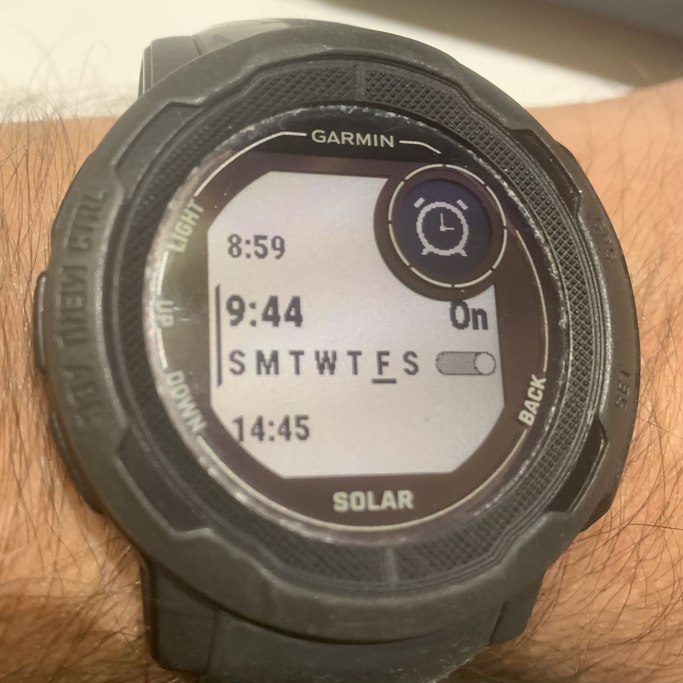
Was setting the alarm easy? Yes to me, as I am using the alarm frequently. Was the alarm interface obvious and informative? No - I didn't realized that the alarm will not trigger.
As a product designer, I consider the notions of "being obvious" and "being easy" highly correlated. The alarm clock was easy to program because I used it frequently. And didn't notice when the alarm would actually trigger since it was easy and automatic operation. Maybe I would pay more attention had I been less familiar with the alarm clock - maybe it was actually my fault??
So the alarm didn't ring because I didn't realize when it would activate. And that was because I used it automatically, assuming that it would trigger as usually. So the interface wasn't informative, it wasn't clear. I conclude this was designer's fault.
"People always say 'it's me', but it's the computer design that's so dumb." -Jef Raskin, a pioneer of interface design
The alarm clock blunder example is one of many situations when users blame themselves for mistakes while interacting with machines. Good design can prevent errors, increase the efficiency of the operation and positively affect users' lives.
"Out of sight, out of mind" is one of the most important design principles. But when confronted with demands for more features, designers default to hiding important items under menus, forgetting about users' cognitive limitations.
"Obvious always wins" is a design heuristic derived from previous one. But screen space is finite. So designers must use it wisely, placing the most important elements in the most prominent locations. Faced with numerous feature requests, they compromise. In the case of the alarm clock, designers' decision not to include information about when the alarm clock would trigger was, at least for me, a poor choice.
And how to find out what is important? By conducting continuous research with actual users. Not using any predictive statistical model, such as LLM. Only actual users will tell the truth.
But here is the thing - did I mention that my 20-year old phone had a better alarm interface? After setting an alarm, it displayed exactly how much time remained until the alarm would trigger, eliminating any guesswork. Is this what we call progress in design?
Continue reading
- I am available for product design projects.
Write to me at hi@mikajovicic.com - Subscribe to my newsletter